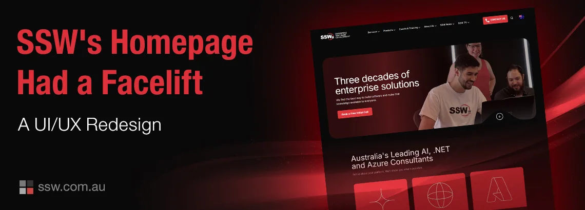
SSW’s new homepage is live after a UX and UI redesign focused on clarity, trust and conversion. See how comparative research, stronger hierarchy and progressively introduced proof turned a crowded homepage into a deliberate customer journey.
User journey mapping is a powerful way to uncover insights about your users’ behavior and preferences. It helps you create more engaging content and design better experiences for your users.
Let’s do an analysis of the UI differences between the FitBit and the Microsoft Band. Watch out, Microsoft… the FitBit user interface just got better. I last blogged about the Microsoft Band 2 and my wishlist of 25 features. I’m pleased that the team has already fixed 3 features, leaving 22 remainin
Guys, I’m happy to tell you that we have completely redesigned SSW TV and I’d love if you could spare a few moments to take a look! http://tv.ssw.com/ Here are the top 3 changes I think you will like: Quizzes: We wanted to provide more value to the viewer and give them an opportunity to
A big thank you to Robin Maes, Andrew Turner and the whole Event Cinemas team who worked tirelessly with the SSW’s guys to deliver a great looking, super fast, site that was on time and to the fixed budget. Thanks to the Telerik Sitefinity team, our favourite Bulgarians, for giving us the updates wi
Updated August 12, 2015: I bought a Tesla. It has the most enormous touchscreen – no irritating nobs to turn 🙂 G’day Developers! For the last month I was driving through Germany, Italy, Austria and Croatia. I hired 3 different cars. Having mainly driven Toyotas, I was keen on experiencing some vari